6 minute read
PROJECT HIGHLIGHTS
THE TEAM
TOOLS USED
TIMELINE

Hey there, you busy recruiters and managers 👋
If you're short on time, here's a quick rundown to get you up to speed. (Readers interested in more detail might prefer to skip this summary and start with the next section.)
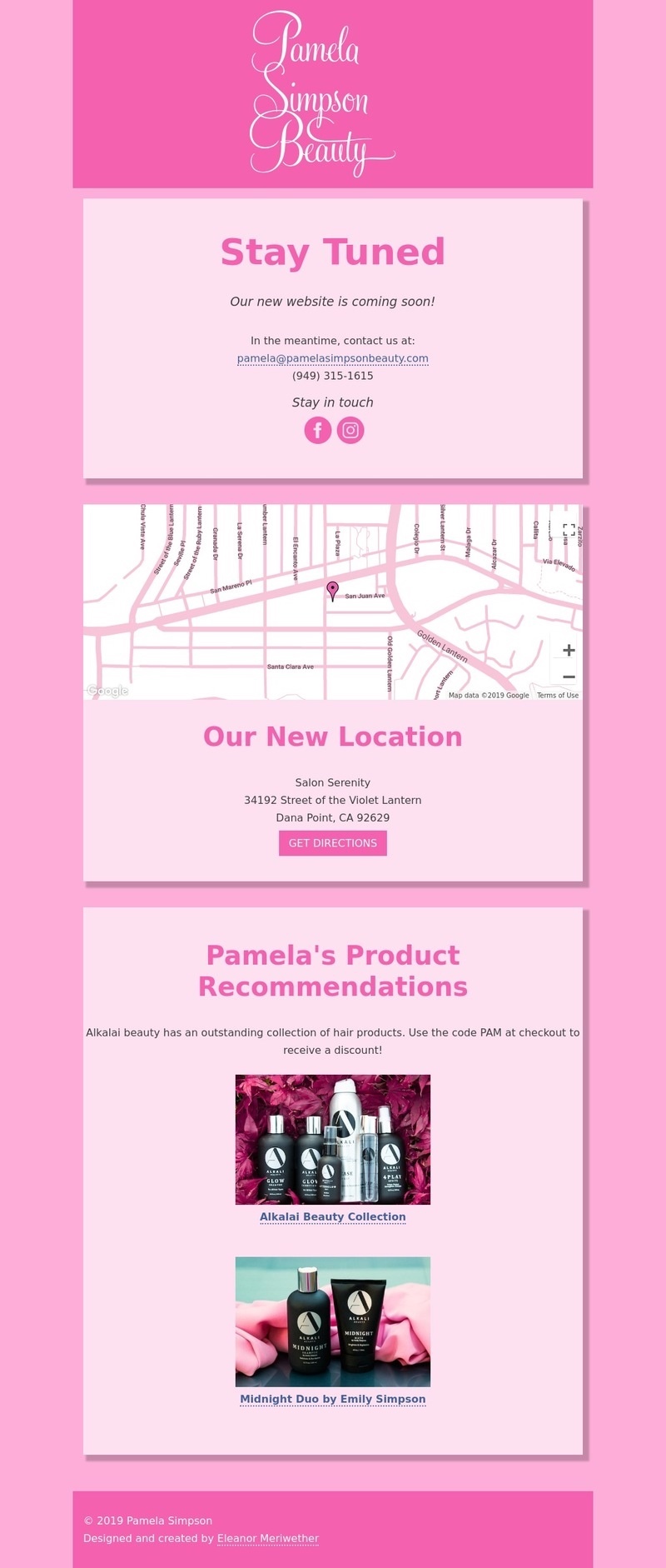
GlobalGreen Warehouses needed a streamlined way to manage their resource-intensive buildings. Their existing tools were outdated, scattered, and didn’t meet new climate or budget go.
As the project’s sole UX designer, I guided the team from chaos to clarity. By questioning assumptions, listening to users, and overhauling the app, I helped cut through the noise and laid a foundation that made managing buildings—and their energy use—a whole lot smarter.

A snapshot of the chaos, storyboard-style—because words alone don’t do it justice:
GlobalGreen wanted a single app to unify building management, modernize tools, and enable smarter decisions—while cutting costs and speeding up future upgrades by keeping full control of the code.
Stratus (anonymized) was hired to build the app, but progress stalled without a clear vision. Scattered teams, conflicting goals, and jargon masked a bigger issue: no one had asked the right questions or involved the right people, leaving stakeholders unsure of their ultimate goal.
By Phase 3, Stratus brought in TensorIoT to get things moving and add clarity.
As the project’s sole UX designer, my job was to understand business and user needs, asking the hard questions to challenge assumptions and translate them into actionable designs.
Over three phases spanning two years, I helped drive the project’s success by aligning the team, making user-centered decisions, and setting clear, data-driven priorities.

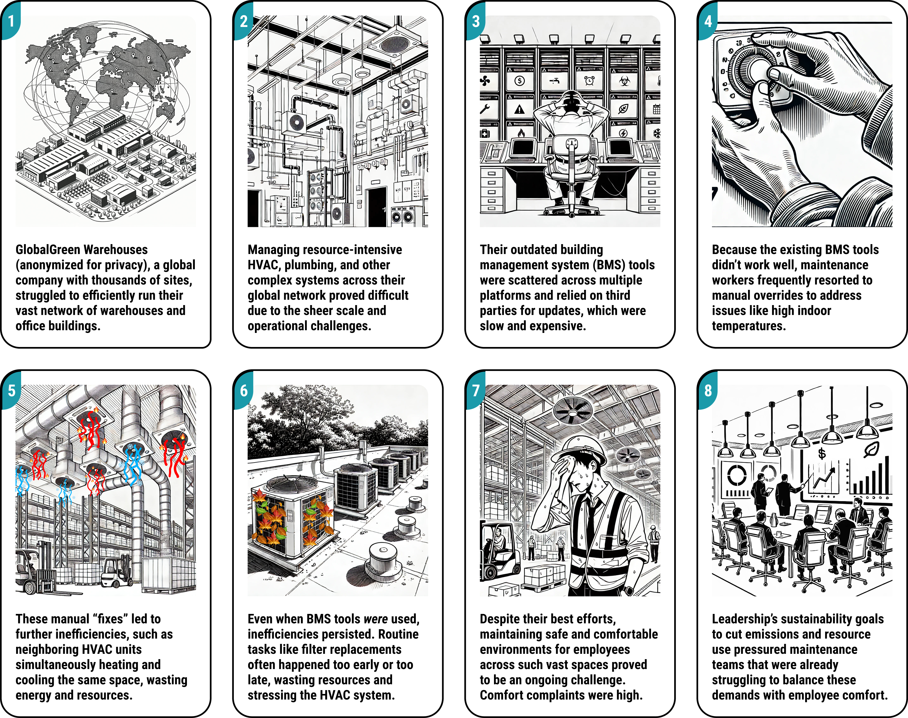
When I joined, the team handed me a list of features and rigid instructions to cram everything onto a “single of glass”—just slap some “shiny” on it, no time for bigger questions.
While the polished mockup checked all the boxes requested by the team, the first demo gave stakeholders some serious concerns: we didn’t have access to the data needed to build these advanced features, and it was unclear whether this design even addressed the right user pain points.
This dashboard tries to do too much at once, leaving users unsure where to focus—managers need priorities, not a buffet of metrics.Not only was this overwhelming, it wasn’t scalable - Global Green has thousands of sites, each with dozens of HVAC machines, and it clearly wasn’t going to work to cram them all in on this page.
Most of the energy usage data this page relies on simply doesn’t exist, making these visuals little more than wishful thinking. For example, GlobalGreen had no way to gather electricity usage at the site level, and retrofitting their infrastructure would come with sky-high costs and an extensive timeline that we didn’t have.
Vague menu labels leave users unsure where they’re going, creating frustration instead of an intuitive workflow. What is a “my eBSM”? Are the links under Buildings or Operations filters, or new pages?
After the v1 demo flopped, the team was stuck, unsure where to go next. Three phases in, it hit us: we’d skipped the basics. I stepped up and started asking the tough questions:
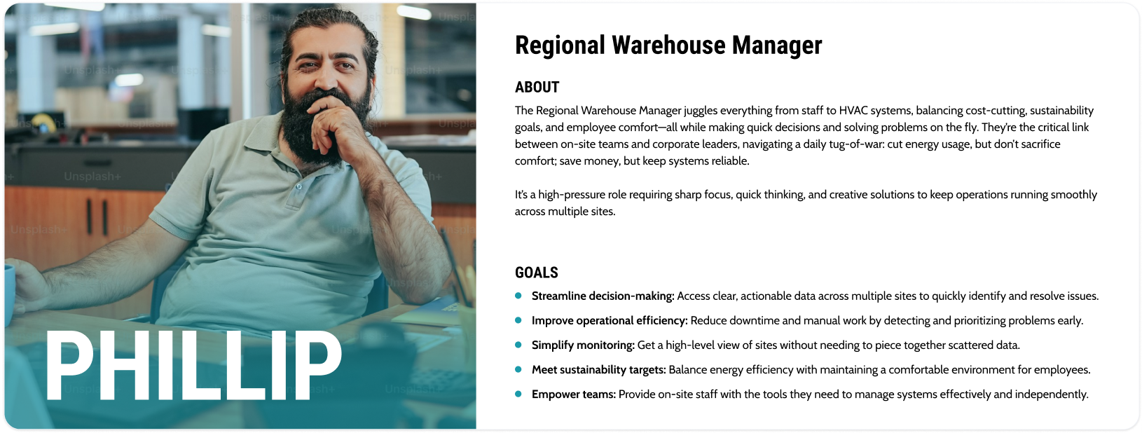
To tackle these questions, I identified Morgan, the Sr. Program Manager, as our key decision-maker, and together we pinpointed Regional Warehouse Managers as our central users. Reviewing existing apps and touring sites with Morgan laid the groundwork for key insights and next steps.
Faced with a flood of acronyms and technical HVAC terms, I created a glossary to demystify GlobalGreen's dense lexicon. This initiative not only helped our team speak fluently with stakeholders, but also provided a solid foundation for informed design decisions throughout the project.
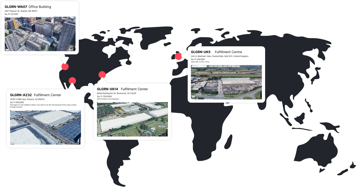
I created this map of the four pilot sites to give our discussions some much-needed grounding. With so many buildings and no one familiar with GlobalGreen’s infrastructure, conversations kept spinning in circles. Visualizing specific locations with their official names helped us move from vague ideas to concrete planning.
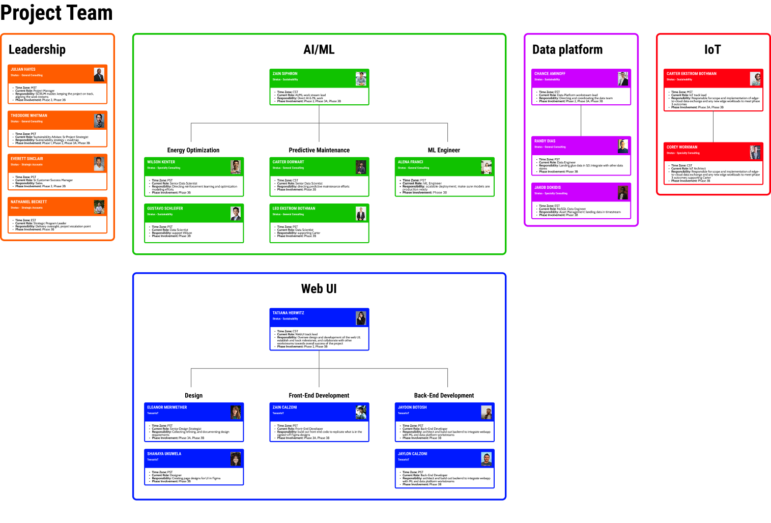
I mapped out the connections in our oversized Phase 3 team—spanning two consultancies—because with a group this big, no one knew who to ask for what. The chart made roles clear, smoothed communication, and got things moving.
With the groundwork laid, it was time to hear from the users. While Morgan provided helpful insights, I needed a broader perspective. Through interviews with six Regional Warehouse Managers, I uncovered the daily challenges and pain points—many of which were glaring in the old BMS app.
This dashboard tries to do too much at once, leaving users unsure where to focus—managers need priorities, not a buffet of metrics. Not only was this overwhelming, it wasn’t scalable - Global Green has thousands of sites, each with dozens of HVAC machines, and it clearly wasn’t going to work to cram them all in on this page.
Updates required time-consuming, costly coordination between multiple third parties. To avoid this, GlobalGreen teams started linking their own add-on apps here, which led to duplicated features and a fragmented experience.
I mapped out the connections in our oversized Phase 3 team—spanning two consultancies—because with a group this big, no one knew who to ask for what. The chart made roles clear, smoothed communication, and got things moving.
I mapped out the connections in our oversized Phase 3 team—spanning two consultancies—because with a group this big, no one knew who to ask for what. The chart made roles clear, smoothed communication, and got things moving.
Learning about the existing system’s pain points clarified why the first demo flopped—we had unintentionally mirrored its flaws. Ambiguous navigation and overwhelming, unfocused data were already problems, and our v1 redesign had only amplified them.
While I was busy interviewing users, the devs looked into what data was actually available for us to use. We then regrouped for a Long-Range Planning session, where I guided the team through insights and priorities, sparking ideas and creating a roadmap that earned enthusiastic stakeholder support 🥳.
With a clear roadmap in place, we turned our plans into action. I designed a new app that directly addressed both user pain points and our core business goals, transforming insights into a practical, cohesive solution. Here’s a look at how the new design came together:
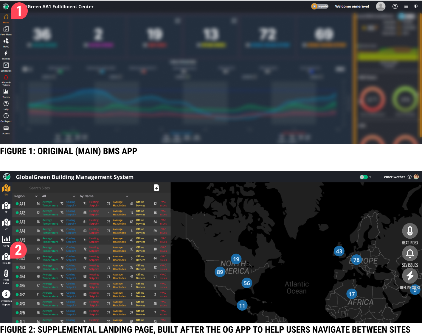
The original app’s landing page, added as an afterthought, was cluttered and lacked clear hierarchy, leaving users struggling to navigate effectively.
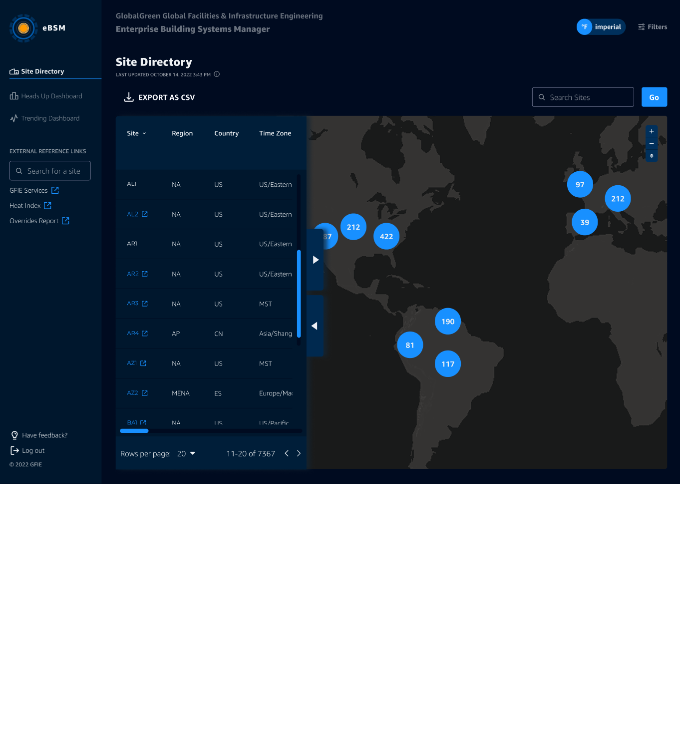
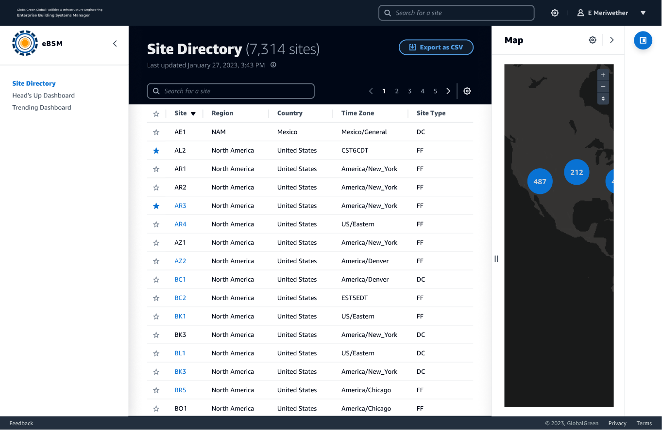
I gave the site directory a much-needed glow-up—same features, but with smarter spacing and a clearer color hierarchy that actually makes sense. The once-cluttered landing page now feels like a proper starting point, setting the stage for smooth navigation and future upgrades as we phased out the old app.
The original app’s vague links like "Home" or "GR" left users guessing, while cluttered filters and unlabeled external links added to the confusion—issues the v1 redesign failed to address.
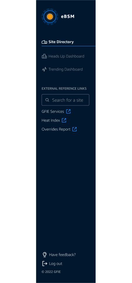
I revamped the navigation with clear, descriptive labels like "Site Directory," "Heads Up Dashboard," and "Trending Dashboard," so users instantly knew where to go. Filters were removed from the side menu, and external links were clearly marked for a smoother, more intuitive experience.
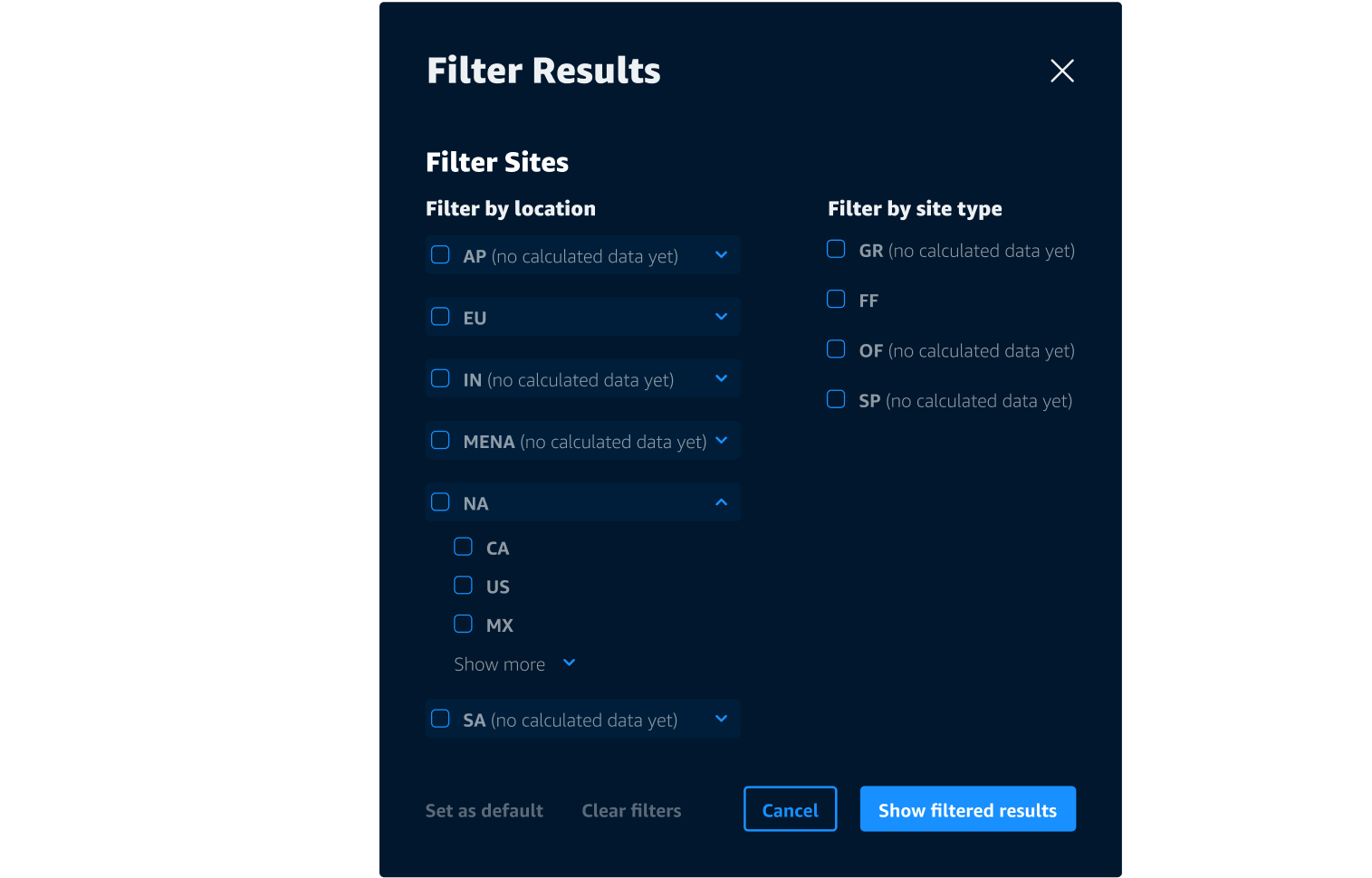
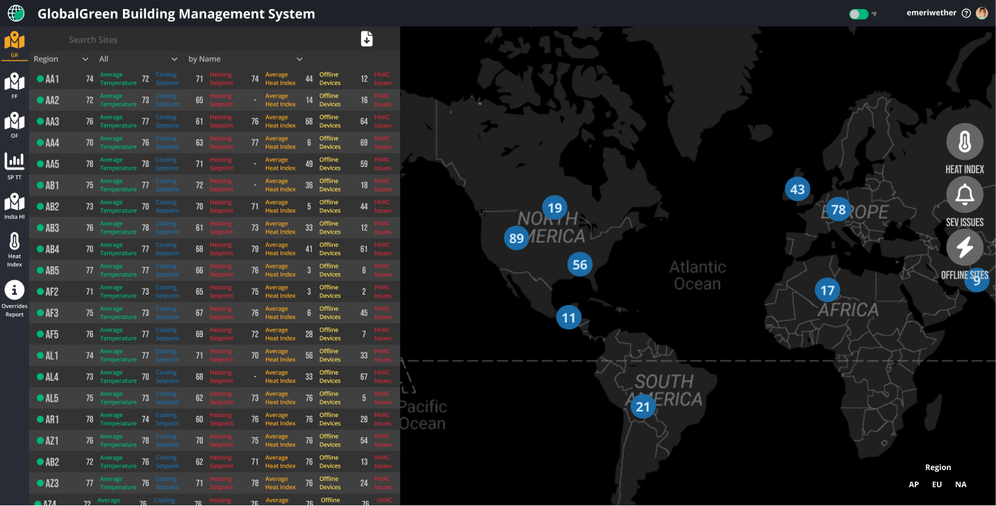
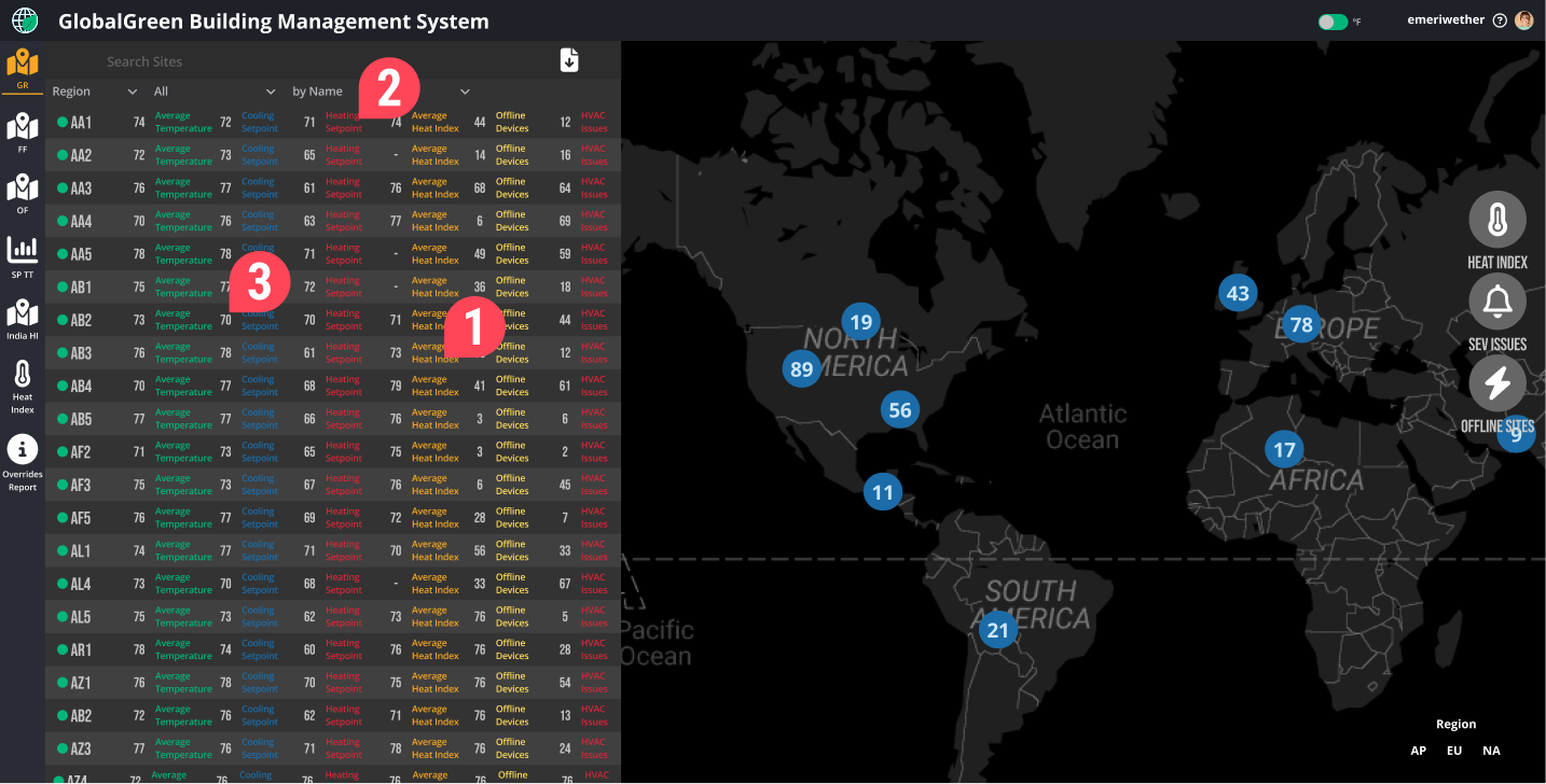
Filters were scattered across the map, table, and navigation, forcing Regional Warehouse Managers to hunt through thousands of irrelevant sites just to focus on their assigned region or site type.
Filters, once scattered everywhere, are now grouped in one clear menu with intuitive toggles and a handy 'Set as Default' button—helping users focus on what matters without getting lost in irrelevant noise.
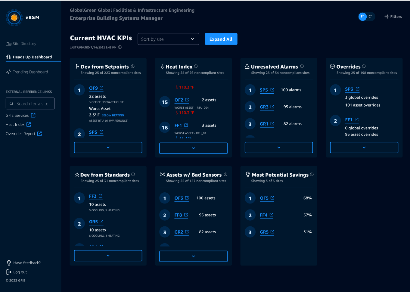
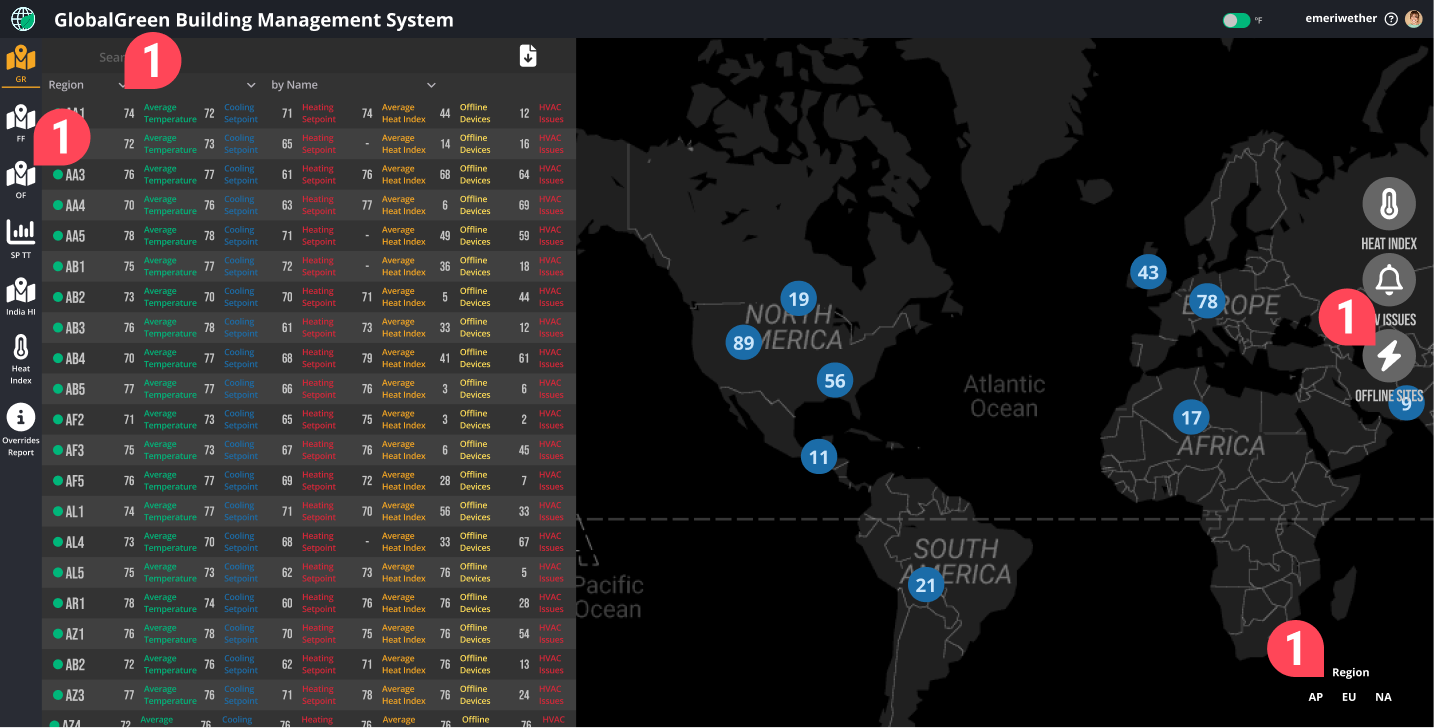
Managers were buried under a flood of unorganized data, left guessing which sites needed attention. Without a way to prioritize or filter, they spent more time hunting for problems than solving them.
I streamlined the chaos with a Heads Up Dashboard that spotlights the top problem sites in seven key categories. Paired with tailored filters, managers can focus only on sites in their purview, turning endless data into a clear action plan.
The V1 mockup promised big, flashy visuals but relied on inaccessible or incomplete data, making it more of a wish list than a usable tool.
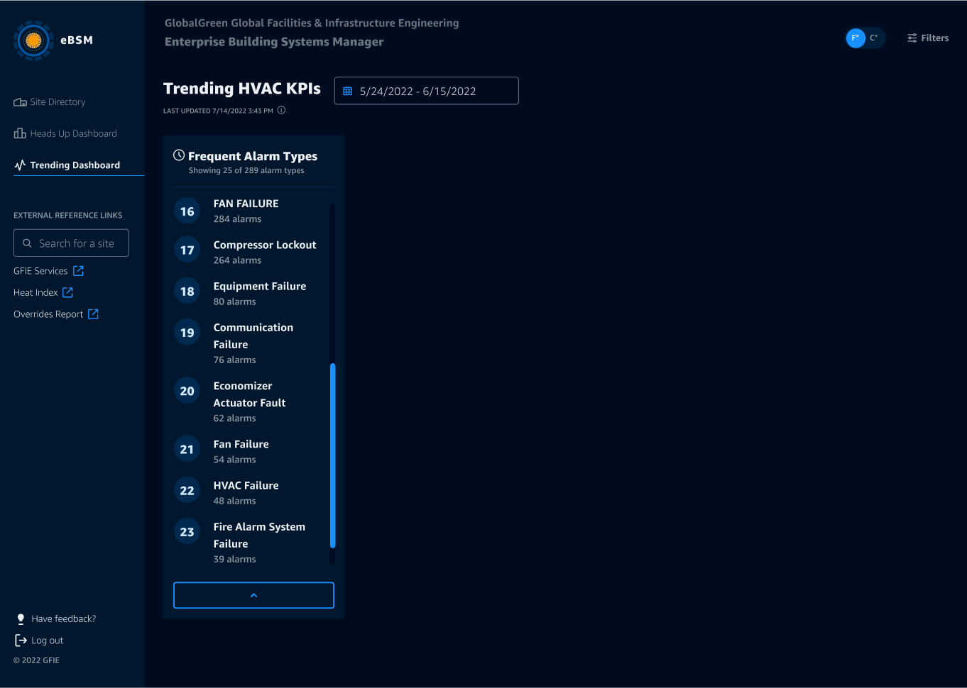
All of the v2 redesign was designed with realistic, accessible data at its core, ensuring every feature—like the Trending Dashboard—delivered actionable insights managers could trust. By ditching impractical visuals and focusing on meaningful patterns, v2 empowers users with reliable tools for smarter planning and decision-making.
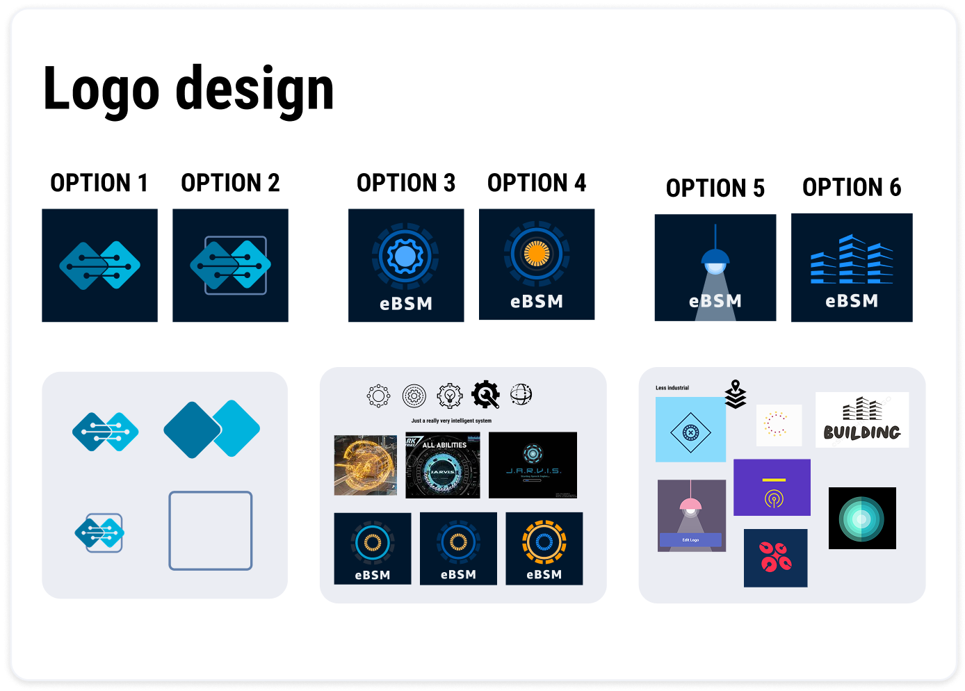
The customer wanted a unique logo for the app, distinct from GlobalGreen’s branding. Options 1 and 2, focused on interconnectedness, missed the mark for Morgan. Inspired by his “one app to rule them all” comment, I explored Jarvis-inspired designs (3 and 4) and concepts rooted in building infrastructure (5 and 6).
Option 4 struck the perfect balance: it captured the app’s purpose while staying cohesive with GlobalGreen’s identity—and Morgan was sold.
After the holidays, fresh funding meant we could level up the app. Armed with feedback from v2, Morgan and I zeroed in on high-impact upgrades. The result? Smarter features that boosted user experience and business outcomes. Take a look:
Building v2 with custom React components meant endless bugs and layout headaches, leaving us scrambling to fix things instead of focusing on new features or big-picture improvements.
Switching to Cloudscape gave us responsive, out-of-the-box components, freeing up time for impactful features. We also reorganized settings like the temperature unit into app preferences, streamlining filters and speeding up development.
V2 filters were a solid step forward—finally all in one place—but they still fell short. Managers needed more ways to tailor the filters to match their unique responsibilities, which often stretched across regions and didn’t fit neatly into standard categories.
Building on the streamlined design from v2, we expanded filtering options and introduced a "favorites" feature. These updates gave managers precise control, ensuring they could focus only on the sites that mattered most.
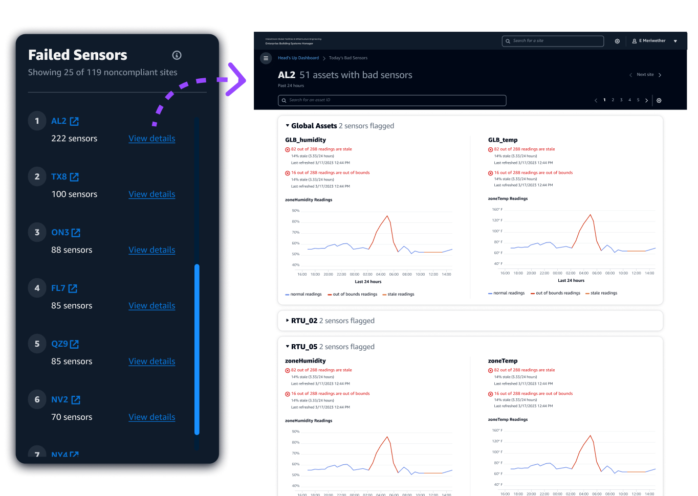
The failed sensors leaderboard on the v2 designs flagged problematic sites but offered no actionable steps, leaving managers to dig through data to find which assets were failing—a tedious and inefficient process.
I reworked the failed sensors leaderboard with ML, adding clear next steps: managers now see which assets are failing and why—whether it’s missing data or absurd readings. This saves time and keeps the system’s critical data sources reliable.

Over three phases, I became the team’s not-so-secret weapon—asking the sharp, game-changing questions that shifted priorities and cleared the path forward. By bridging user needs with business goals, I crafted designs that didn’t just solve problems—they set the stage for future success.
The payoff? A final demo I led that left stakeholders energized and on board, showcasing a sleek, scalable app that managers could actually use. With this foundation in place, the next steps were clear: continue migrating pieces of the old apps into this one, expand to other target personas, and ensure each new feature added strategic value.