5 minute read
PROJECT HIGHLIGHTS
THE TEAM
TIMELINE

Hey there, you busy recruiters and managers 👋
If you're short on time, here's a quick rundown to get you up to speed. (Readers interested in more detail might prefer to skip this summary and start with the next section.)
EcoLogistics Solutions, our anonymized client, packs bottles of beverages onto pallets in warehouses and ships them to customers like gas stations and grocery stores. They faced a major issue: the wrong products were being packed onto pallets, leading to customer complaints and confusion. They turned to TensorIoT to streamline operations with a cohesive application.
As a designer, I recognize that developers are key consumers of my Figma designs, so I focused on making the designs clear and actionable for them. I converted existing designs from CloudScape to Material UI (the main project goal), enhanced design documentation with devs in mind, and prioritized key features with a phased approach to keep things realistic for our devs. Collaborating closely with the developers, I ensured the app was consistent and scalable, shipped on time, fully met the customer's needs, and made the developers look good.

EcoLogistics Solutions packs and ships beverage pallets to customers like gas stations and grocery stores. They faced frequent issues with incorrect products on pallets, causing customer complaints. To fix this, they built a computer vision solution to scan pallets, compare contents with shipping orders, and alert packers of mismatches, ensuring accuracy and providing digital evidence for disputes.
Despite their innovative solution, EcoLogistics used multiple apps to visualize their data, making the process inefficient. They needed a streamlined approach, and turned to TensorIoT for a single app, PalletVision, to track pallets in real-time, ensure correct products are packed, and provide digital proof of accuracy.
I joined after initial designs were made using CloudScape. EcoLogistics then requested a switch to Material UI (MUI) for better alignment with their existing infrastructure. My task was to convert the original designs from CloudScape to MUI, and update pages with new requirements. I quickly realized the Phase 1 designs were too basic, and lacked interaction details, which would leave devs guessing during implementation.
Recognizing developers as key consumers of my work, I refined the designs to ensure they were clear and valuable maps. My goal was to make sure developers knew exactly what needed to be built so they could focus on executing it well.

While translating the PalletVision designs from Cloudscape to MUI was relatively straightforward, the main focus of my time on this project was to enhance the design deliverables into a resource that would better support the developers in building it.
When I inherited the PalletVision designs, they were sparse and lacked detailed documentation. To avoid leaving decisions up to the developers, I conducted further discovery with EcoLogistics, revealing misaligned requirements. I captured these refined expectations to guide the developers, ensuring they had a clear map to build from and could focus on their tasks without guessing.
Outcome: This approach made sure the app was built to the customer's exact specifications, and we didn’t end up with any surprise work after development was already underway.
In the first phase, the only design mapped out for the log in page was this frame. (I’ve modified the logo to maintain customer confidentiality.)
This design alone would leave our devs with more questions than answers: What happens when the user clicks “Existing User? Click Here”? Or “Forgot your password?” Are there any error messages that should be displayed?
While the log in experience seems simple and straightforward at the surface, there are a lot of nuanced decisions that need to be made.
I didn’t want to leave these design details up to the developers, who already had enough to focus on with implementation.
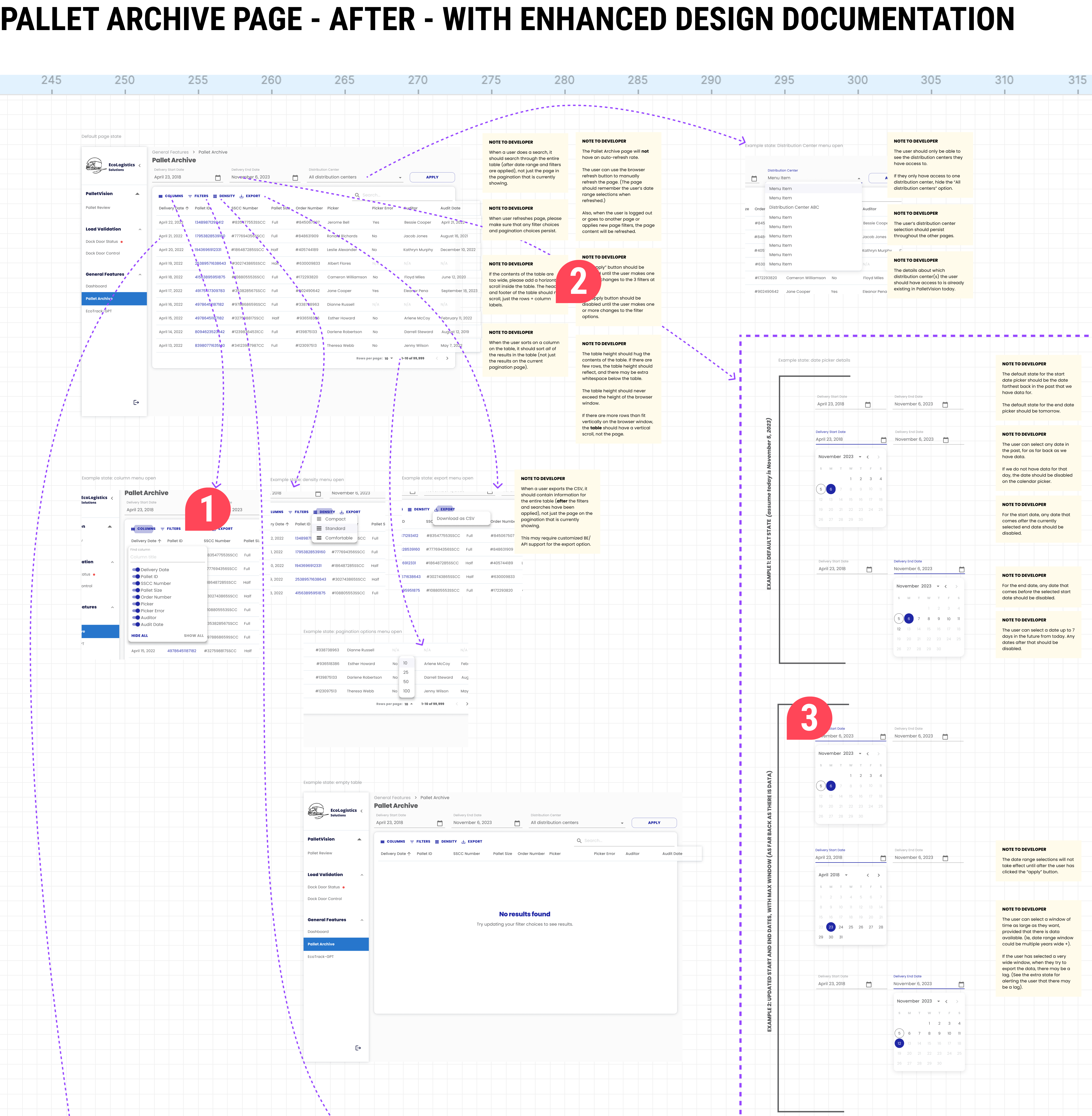
The Pallet Archive page serves as a historical record of all packed and scanned pallets, allowing Warehouse Supervisors to access past pallet “receipts” in case of disputes about deliveries.
The initial designs included only three frames, with two of the frames more refined elsewhere. However, the first frame with the table had only a single view.
Date pickers, filters, searches, and sorts are deceptively complex. Leaving the designs as they were would have left developers with many questions: Are filters in the settings wheel by the pagination? What filter options are available? What if the table has no data? Does a search query cover just one pagination page or the entire table?
To address these issues, I provided more refined design documentation in Phase 2.
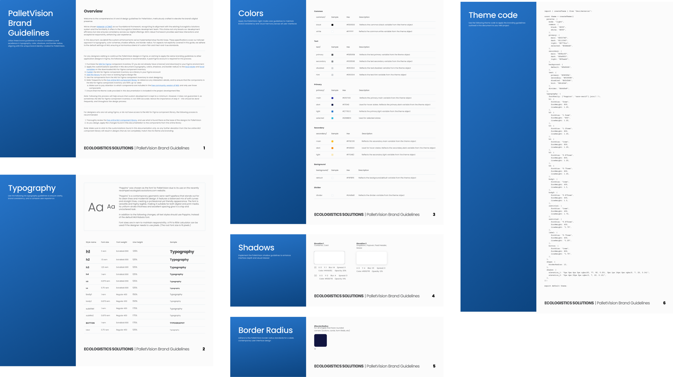
As I started handing my designs off to our front end developer, I noticed that he was styling components individually in the code. I realized this was likely because my documentation wasn’t speaking his language. He was just following our usual process, but I saw an opportunity to improve for cleaner, maintainable code.
To address this, I used the MUI Theme Creator to generate theme code, and added custom code for box shadows and border radiuses. While we iterated on the code together to get the syntax right, my initial work gave the developer what he needed to start theming efficiently.
Outcome: By reaching out to the developer, I discovered this gap between design and development and addressed it, leading to a more cohesive and scalable app, saving development time, and ensuring styling consistency across the board.

In the end, we delivered a high-quality product that exceeded the customer's expectations and was delivered in a timely manner. My work enabled the developers to successfully implement the solution without unexpected delays or challenges.
I loved working closely with our developers on this project. I’ve always been mindful that my designs serve as a map for developers to follow, and the better my instructions, the more likely the vision will be realized. This close collaboration allowed me to see my designs in action and inspired a lot of learning and iteration on how I present designs and accompanying documentation, such as with the theming code.
Throughout the design process, the customer appreciated the guidance and orchestration I provided. They were eager to hit deadlines and ensure the final application was a great experience and bug-free.
Ultimately, this app is helping EcoLogistics build customer trust, assuring them that their deliveries will always be accurate. Consequently, this will enabled them to move towards a more cost-effective, hands-off delivery system. Soon, drivers will be able to drop pallets of beverages at retailers' doorsteps, leave a photo receipt, and move on to the next shop without needing to take inventory with the recipient.
This project not only met the customer’s immediate needs but also set a foundation for future efficiency and reliability in their delivery operations.