5 minute read
PROJECT HIGHLIGHTS
THE TEAM
TOOLS USED
TIMELINE

Hey there, you busy recruiters and managers 👋
Here’s your cheat sheet—skip ahead for the full saga.
DataGuardian (name anonymized) backs up the world’s Salesforce data. Their next act? Using machine learning to turn those backups into insight gold 🪄—and they brought in TensorIoT to help make it happen.
As the sole designer on a fast-moving PoC, I shaped it end-to-end, with strategic design calls that set devs up to build with confidence. I brought clarity to the chaos, prioritized what mattered most, and shaped a dashboard experience that helped the team move fast with confidence. I used targeted stakeholder input and informal user research to craft a solution that looked sharp and spoke sales.
The result? A tool their customers can use to surface high-impact sales opportunities with confidence—and a PoC that’s already sparking new collaborations.

Meet our customer DataGuardian—anonymized here to honor confidentiality agreements. Their core offering? A secure vault for Salesforce CRM data, the diary of every customer interaction. But their next chapter was just beginning: Turning all that data into clear, confident decisions through clear sales signals.
First up: sales data. The goal was to help their clients’ sales teams spot the most promising leads—fast.
From ‘what am I even looking at?’ to ‘let’s close this deal.’
That’s where TensorIoT stepped in. I joined as the sole UX designer, tasked with translating complex ML predictions and raw Salesforce data into a dashboard that was clear, useful, and actually enjoyable to use.
Not just a visualization—a strategic tool to drive smarter, faster decisions for sales teams.

In our initial discovery and design sprint, my knack for asking incisive questions and bringing customer ideas to life steered the project, ensuring smooth and successful progress. Here are some highlights:
Kicking Off Design Discovery
To start, I tapped into our sales team's knowledge about DataGuardian's goals and challenges to shape some initial design sketches.
Before our first working session, I mapped out a rough dashboard based on Sales insights and contract requirements.
It wasn’t polished—but it was just enough to align stakeholders quickly and turn vague goals into something buildable.
Then came the stakeholder kickoff.
I dug into user needs, business goals, and what success should actually look like. Highlights from that session:
Sketch, Scrap, Repeat
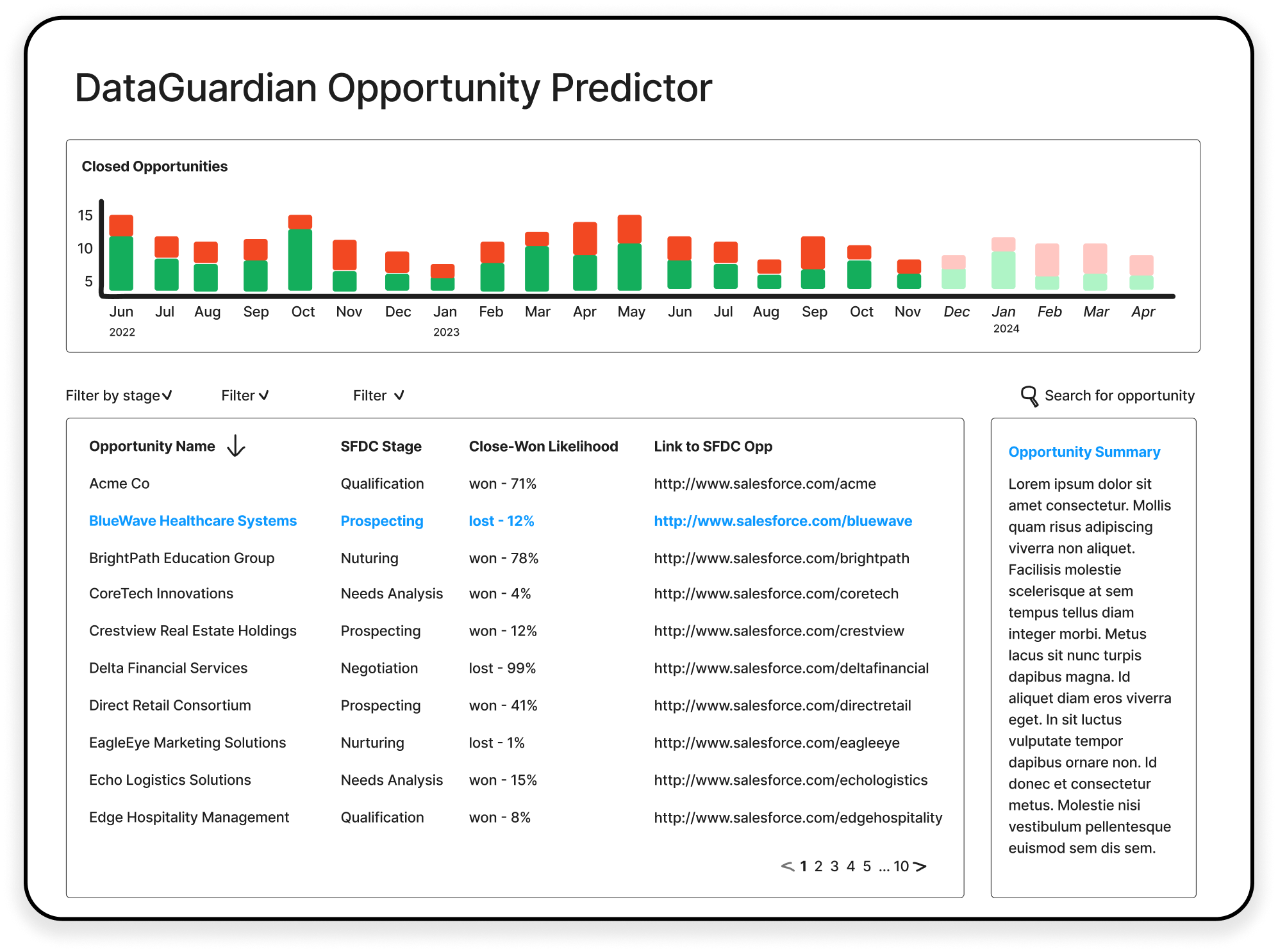
After sketching out a solid starting point, I dug into QuickSight’s DemoCentral, synced with devs on available data, and leveled up the visualizations—making them clearer, sharper, and way more compelling for sales conversations.
When your users sit one Slack message away...
User research wasn’t on the roadmap. It usually wasn’t.
But this time, our sales team was the audience—and just a message away. So I reached out.
I met with our rep and the sales manager to understand how they identify high-potential opportunities, coach their teams, and evaluate strategy. A short conversation, a big unlock.
Achieving Final Sign-off
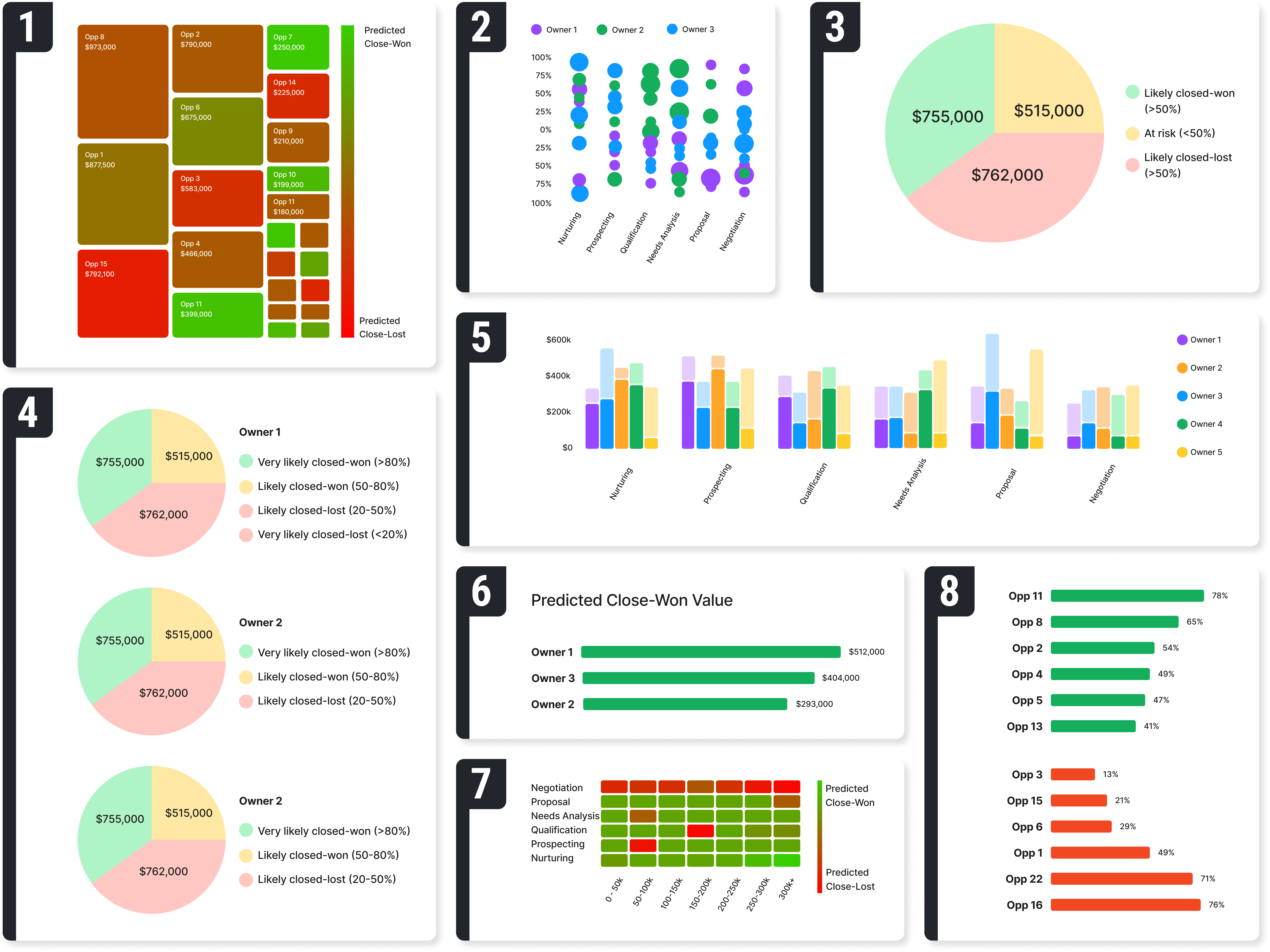
Through several more cycles of discovery, sketch iterations, and review with both the customer and developers, I honed in on graph choices that narrated a well-rounded and compelling story, enriched by insights from my user research.
Simplicity Wins: Individual sellers, pressed for time, prefer straightforward visuals. Complex graphs like heat maps lose them, while simpler ones like pie charts hit the mark.
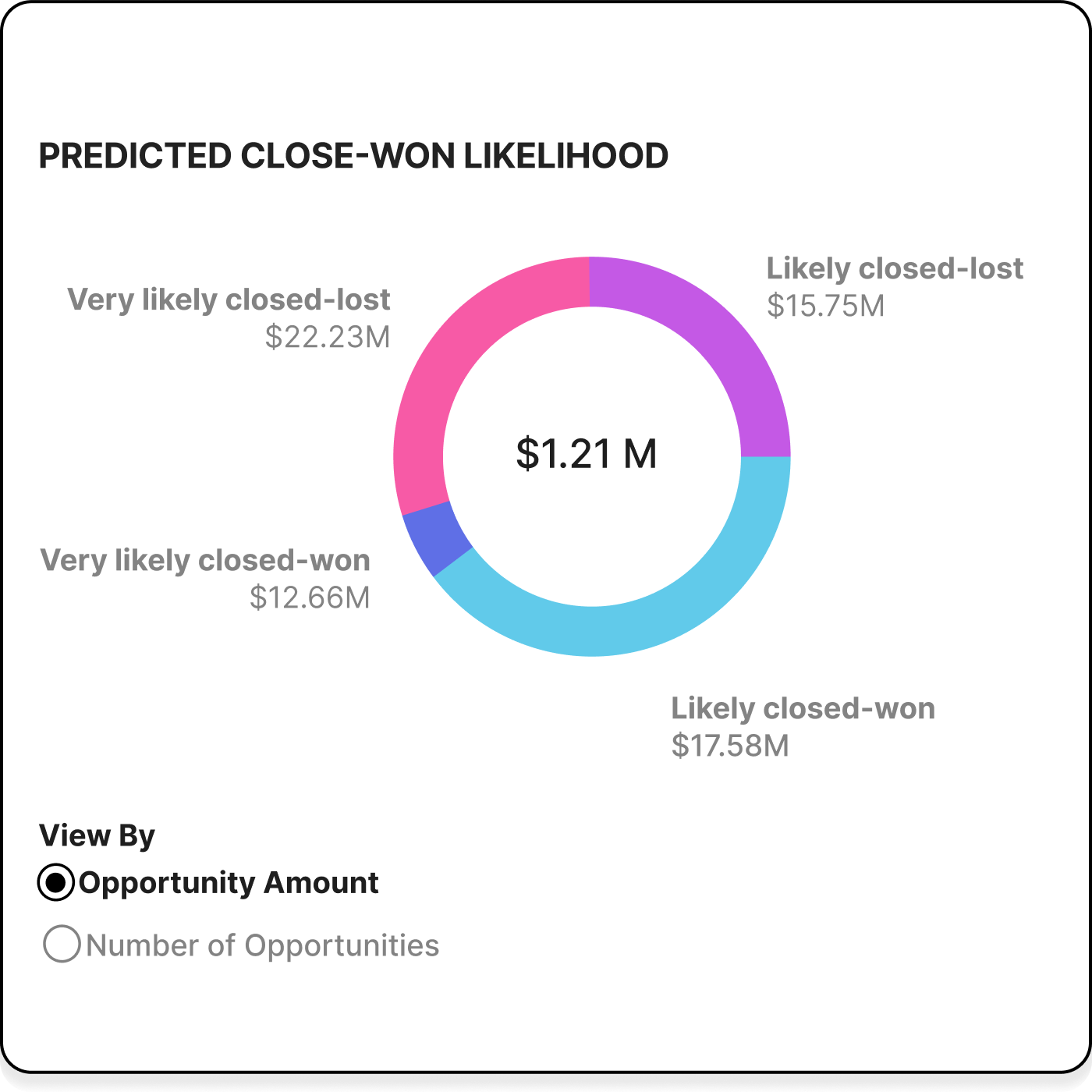
This pie chart provides clear, quick insights, allowing sales reps to see their win and loss potential at a glance. By showing the likely revenue from potential deals, it helps sellers prioritize their efforts and focus on strategies that maximize earnings and meet sales targets efficiently.
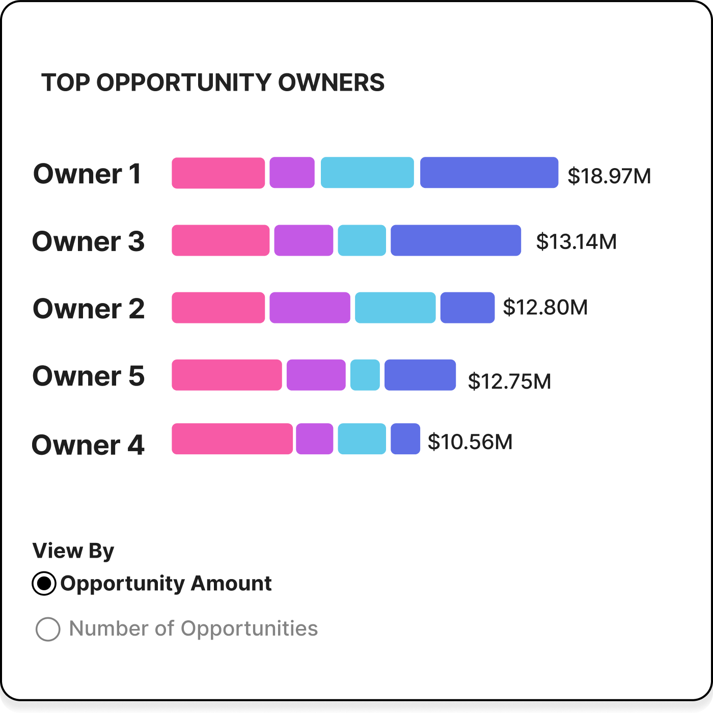
Competitive Spirit: Showing where they stand compared to others fuels individual sellers' drive, with visualizations of rankings pushing them to excel.
This leaderboard illuminates each seller's standing with color-coded predictions of close-won likelihood, sparking a drive to not just climb the ranks but also focus efforts on the most winnable deals to improve their standing and the company's bottom line.
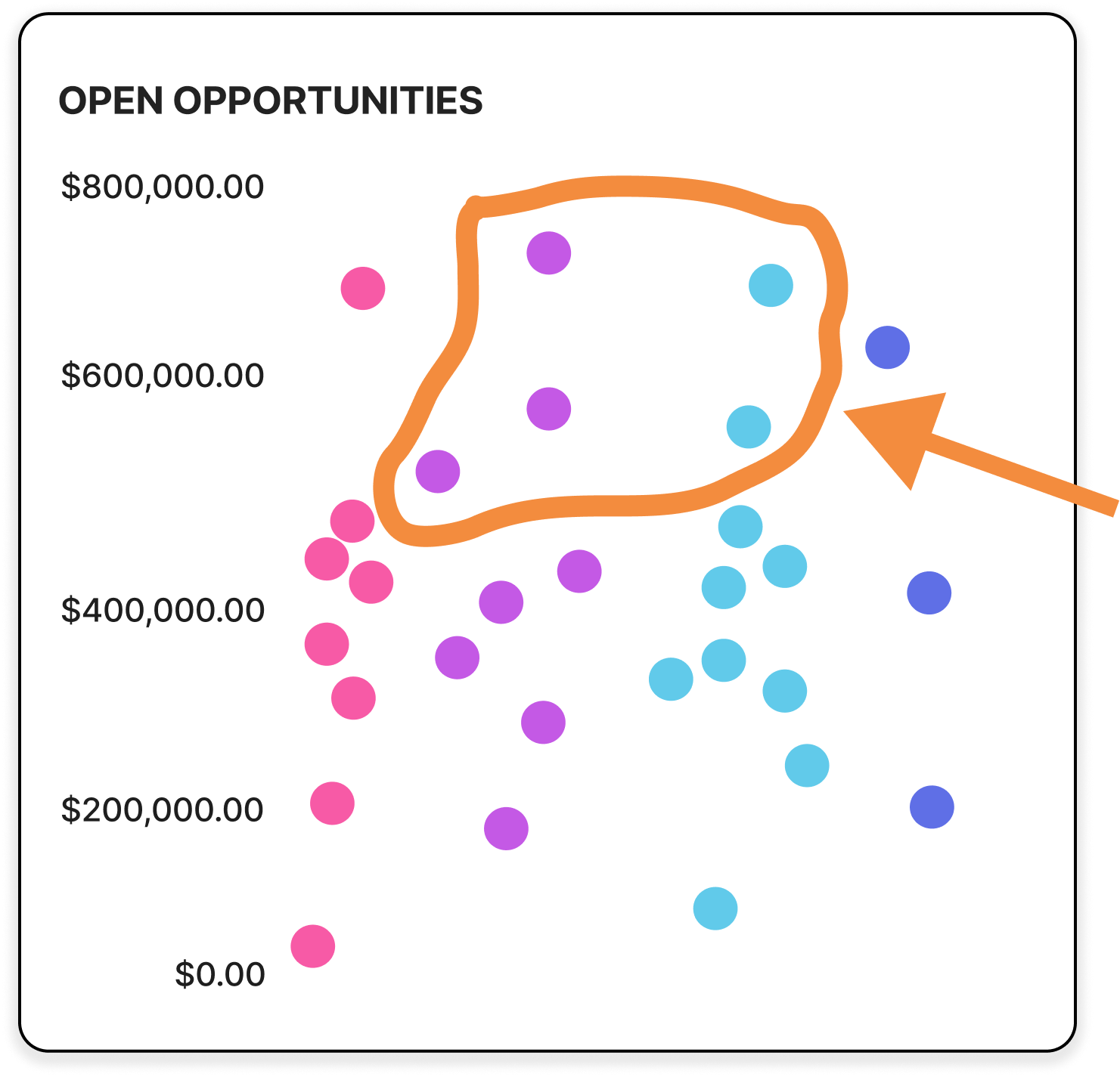
Effort vs. Reward: Sellers boost returns with minimal work by pinpointing opportunities that yield big rewards for the least effort, letting them chase more deals.
The scatter plot guides sellers to high-value, undecided deals at the top-middle—the sweet spot where little effort gets big wins. Deals at the bottom offer less reward, while those on the far sides rarely change, making the center the key target.
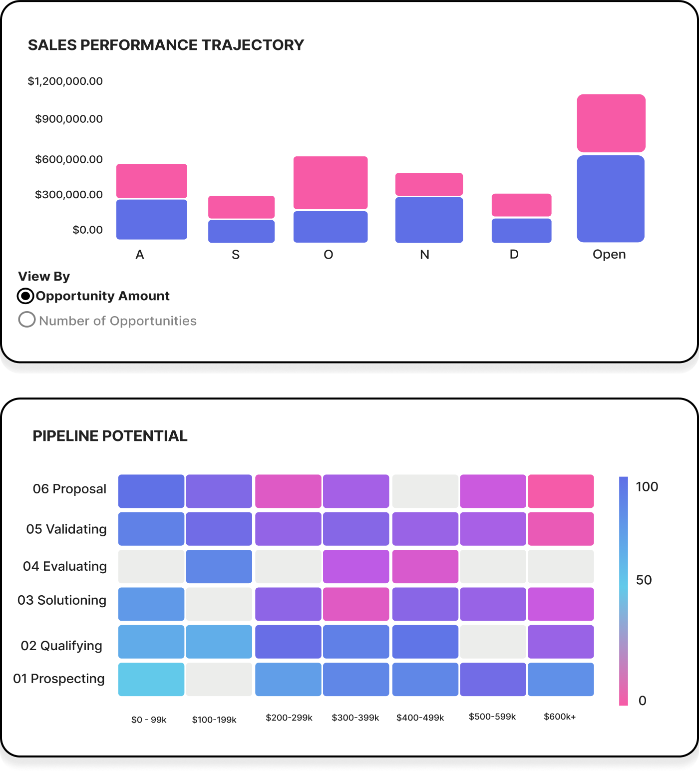
Big-Picture Concerns: Sales managers focus on the overall health of their team by ensuring adequate support, recognition, training, and strong performance forecasts.
The ‘Sales Performance Trajectory’ graph shows monthly wins and losses to help managers forecast and gauge pipeline health.
‘Pipeline Potential’ displays a heatmap of opportunities by closing chance, value, and stage, letting managers adjust tactics and training when deals stray.
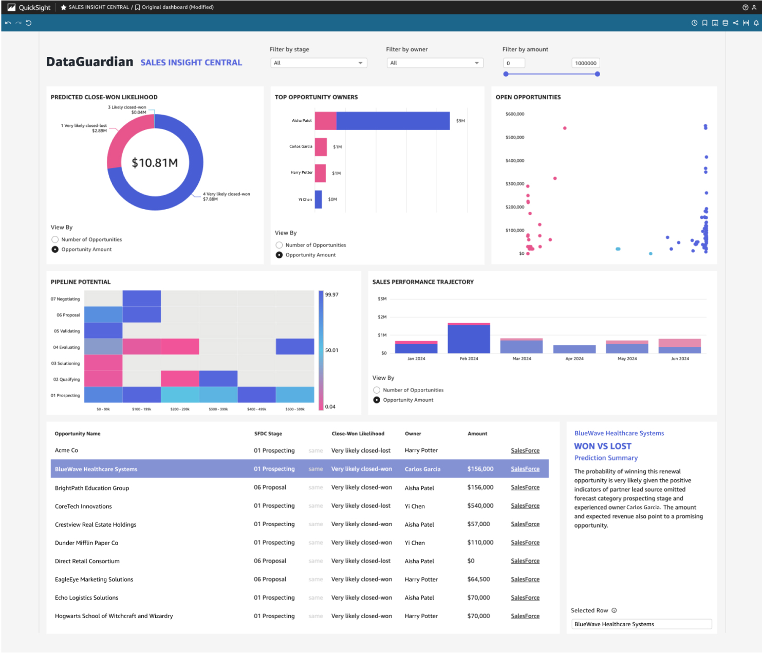
DataGuardian made one thing clear: the dashboard needed to look sleek enough to help sell the product—without sacrificing clarity.
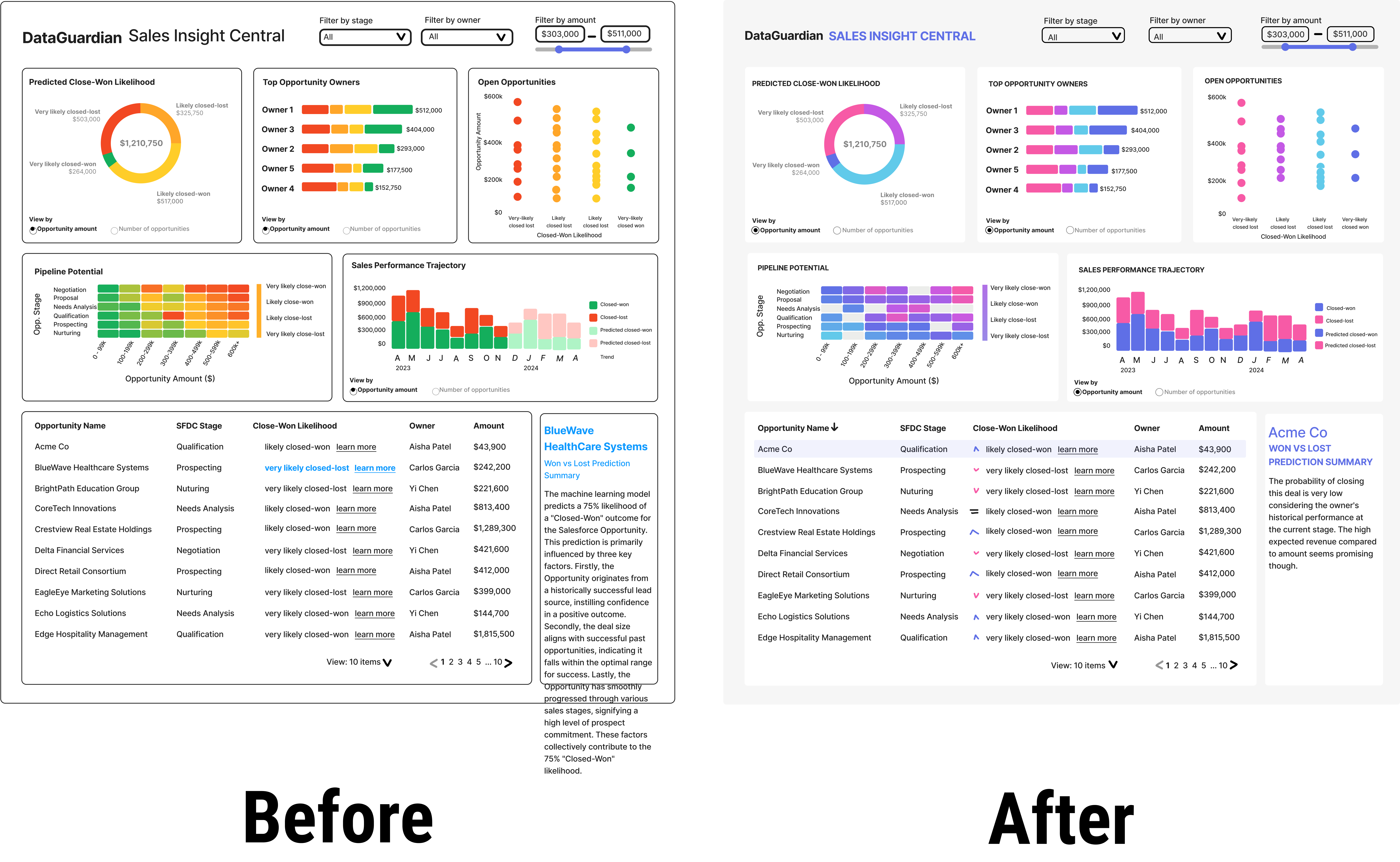
From Basic to Branded
My first pass prioritized clarity, using a red-yellow-green palette that was easy to scan—but looked a little too… elementary.
So I reworked it using their brand colors. The result? A sleek, elegant design that felt polished and perfectly at home in the rest of their ecosystem.
Sign-Off, Full Speed Ahead
By the end of our two-week sprint, I secured design sign-off—confirming that the dashboard’s structure, flow, and content hit the mark. With that green light, the dev team could charge ahead with confidence, no surprise revisions in sight.
As designs turned into dashboards, I worked closely with developers to bridge the gap between vision and reality. When QuickSight’s constraints clashed with the UX vision, I partnered with devs to rethink, adapt, and deliver a scalable solution—without losing sight of user goals or timelines.
I led regular reviews, flagged issues early, and teamed up with devs to rework tricky components—always with users and timelines in mind. The final result felt polished and effortless… even if it wasn’t.

The final PoC dashboard didn’t just meet expectations—it kicked off new conversations, new projects, and a whole lot of high-fives. DataGuardian was thrilled, and my team saw firsthand how thoughtful UX can turn raw predictions into powerful, decision-driving tools.
The ripple effects were real:
Designing in QuickSight wasn’t glamorous—but it was real. And real is where UX shines. This PoC wasn’t about perfection; it was about clarity, usefulness, and proving that something rough around the edges could still spark real excitement.